Uninhabited
Introduction: New York, New York
It is a miracle New York works at all. The whole thing is implausible. E.B. White
I will argue in this paper that the correspondence between the idea of New York and the actual city of New York has grown increasingly tenuous. This idea of the City1—the “City that never sleeps”— had until recently evolved simultaneously, in both the temporal and spatial sense of the word, with the eponymous city of stone, steel and cold cash (1626 to 2005; Latitude: 40° 45 Min. 0 Seconds N. Longitude: 73 º 59 Min. 49 Sec. W). But today, this is no longer the case, and in fact, this mental aspect of New York appears in the process of detaching itself not only from the City in question, but also from the physical constraints and concerns of time and place. What’s more, this idea has become an entirely imaginary construct and no longer representative of anything but has become itself an autonomous entity—familiar but alien, comprehensible but abstract, populated but uninhabited—in a word, a “City Mediascape.”
I am using this term—City Mediascape—to suggest the simultaneous presence of a “second” New York. No longer functioning as a metaphor, but as a parallel virtual City, derived from, informed by, but independent of, the actual material and functioning metropolis. I will further argue that because of the competition between New York City and the City Mediascape, it is no longer possible to experience New York directly through one’s own senses, which is to say, free of the mediating/meddling influences of photography, cinema, television, and advertising.Media, which truly became mass, just as the City established its preeminence among the cities of the world.
This inability to experience New York in a purely phenomenological2 sense of the word can have tragic consequences, as in the death this past winter of Nicole DuFresne, an “aspiring” playwright and actress. I believe that Ms. DuFresne, who was murdered in a mugging on the Lower East Side, could have avoided her fate had she and her friends not confused their life in New York, with the lives of the fictional characters on the TV show FRIENDS, which was set not in the City, but in City Mediascape.
For the purposes of this paper, I will look at the commercial implications of this division of mind and body, to see how marketers use the idea of New York to imbue ordinary objects (and thus ordinary lives) with the sophistication, glamour and power long associated with the City.
This paper will also show how the use of certain iconic aspects of the City—repeatedly reproduced, fabricated, and replicated in photography, literature, theater, film, TV, music, paintings, cookbooks and video games—have superseded in importance the concrete attributes of City, including its celebrated architecture, avenues and neighborhoods.
Finally, using the evolution of the marketing of the fashion brand, Donna Karan New York (DKNY), I will discuss how the City Mediascape has become a commercial medium, through which the meaning of the City is translated—through sets of readily consumed images— and then packaged and shipped to local consumers and pseudo-inhabitants outside the City limits. In the case of DKNY, the idea of New York not only moves merchandise but also advances the notion of “transnational identity,” while preparing individuals for “Global Citizenship.” Two ideas that Steven W. Lewis explored in his study of subway billboard advertising in Hong Kong, Taipei, Shanghai, and Beijing.3 I will go one step further than Lewis to suggest that the concept of Global Citizenship presupposes an entirely abstracted sense of place—a preferred place—which, while seemingly occupied, is actually “uninhabited.”
Shades of Black and White
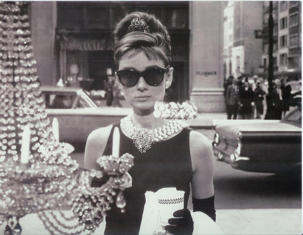
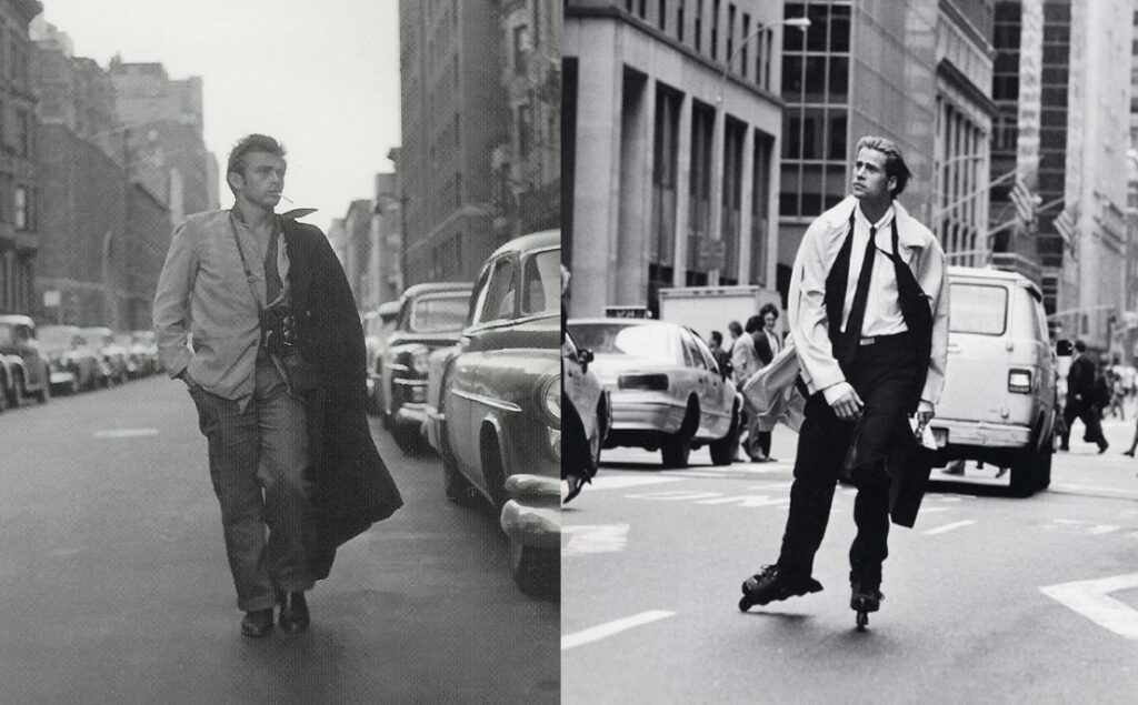
The classic New York City fairy tale, Breakfast at Tiffany’s, 4 was shot not only in color but in TECHNOCOLOR®. However, if you ask someone if the film was shot in black & white, as I asked ten friends, they will likely pause before guessing correctly.5 One reason for their uncertainty is that many people first recall the much-reproduced publicity stills and these— in particular the iconographic shot of the archetypal gamine, Holly Golightly/Audrey Hepburn (See Ill.1)—were for the most part printed in black & white. However, I would like to suggest that even if we knew for a fact that the film was shot in color and were also perfectly aware that the publicities stills were printed in black & white, we would still pause before answering. The reason for this disconnect is simply that we want this film to be black & white. A film set in the
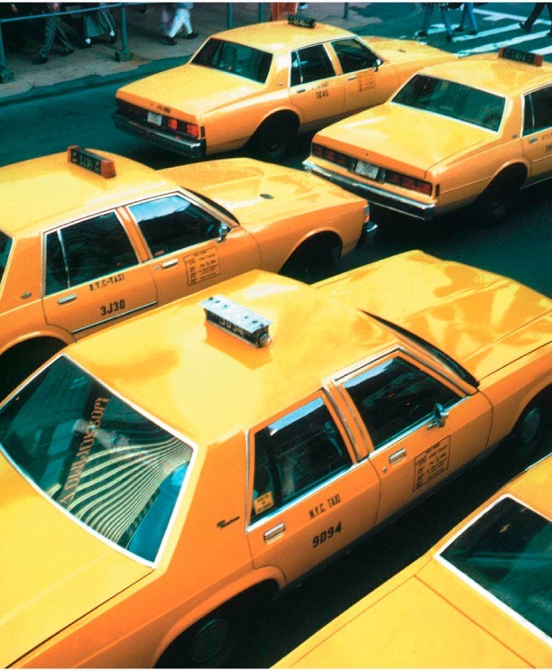
City, a film with City themes, is understood and experienced in black & white. Qualities, such as glamour, sophistication and style, seen in the context of New York, were always expressed in black & white. The little black dress, the black-tie event, even the black & white cookie is de rigueur. The 1980s, which, in retrospect, may have been New York’s last assertion of its traditional prerogatives (a time when the City Mediascape aligned closely with the actual City) made a fetish of black to the extent that marketers could charge a premium of over 15%, on the price of any matt black item.
The centrality of black & white to idea of New York is still quietly, almost subliminally, confirmed through various media, for example, The New York Times Magazine, Men’s Fashion of the Times, which while a less sincere salute than that quintessential New Yorker, Woody Allen’s, celebrated “love-letter” in celluloid, Manhattan6, is informed by the same ideology. Theater critics continue to refer to Broadway as the “Great White Way,” and when the organization NYC 2012 created a television commercial to rally support for the City’s Olympic bid, the spot it created was shot in black & white. A New York that defies this convention ceases to be New York. A white limousine fits perfectly on Sunset Boulevard but is an eyesore on the streets of New York.7
It is not just the world that came to know New York from photography and film, New Yorkers themselves also know the City from pictures they’ve seen and movies they’ve watched. As mentioned above, in a happy coincidence, New York came of age with mass media and consequently, it is likely the most documented City in history.
Its most famous photographers and, I suggest, the most influential as well—from Steichen and Stieglitz to Lewis Hine and Weegee, and from Bourke-White to Bernice Abbott and William Klein—all shot in black & white.
If photography was not sufficient in itself to imprint a particular image of New York on the modern world, then film finished the job. From the early 20th Century up to the 1960s, the City has provided locations for a thousand black & white movies. In addition, television programming, from its postwar advent through the popular acceptance of color TV, offered innumerable representations of the City and its “eight million stories.”8 The finished product of so much artistic, commercial and media attention is a familiar, but manufactured sense of place, one as artificial as the California framed by Sunset Magazine, which was originally published to advance the real estate interests of the Southern Pacific Railroad.9
Perhaps, because both mass media and modern urban architectures grew up and matured together in New York that the City’s association with black & white was inevitable, but I would suggest something more was at play. It is possible Paris has been photographed with the frequency and affection of New York, and coal-fired London offered its documentarians countless shades of gray, but neither city is associated with the rich semiotic play of black & white.
I believe black & white became the principal signifier of New York because New York is both an ironic commentary on and a rebuke of Modernism. Again, this may be the happy result of a historical accident.
In the early days of the 20th Century, European consciousness, formerly the light of the world, was flickering. Modernism, a reaction, and repudiation of a moribund Western ideology, advocated a kind of wholesale relativism conceived to reject both “sense and sensibility.” Freud’s unconscious, Einstein’s relativity and Duchamp’s provocation were simply more than the old order could process. (If not Nude descending a Staircase No. 2 than Fountain may have been the final straw.) 10
The essence of Modernism’s message was that the world is no longer black or white. New York mocked this conclusion by responding, “Perhaps not, but it is black & white.” What’s more, by the time the First World War knocked the continent senseless, New York had already announced both its authority as well as its ascendancy with a particular manifesto, written, like the original Decalogue, in stone. (The contemporary version may be written in Shanghai, but the preferred medium there is steel and glass.)
New York manifested its destiny with a succession of “tallest buildings in the world”—Singer, Metropolitan Life, Woolworth, 40 Wall Street, and the Chrysler Buildings—culminating with perhaps the most iconic building of all time, the Empire State Building. This slender, steel framed, monochromatic, stone clad, Art Deco skyscraper, which defined New York as sui generis among Cities, was introduced to the world in black& white.
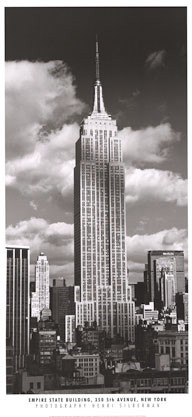
The Empire State Building not only confirmed a formal aesthetic— the City’s signature black & white—but also established a myth and a new ideology. And this myth so imposed itself on reality that as the 20th Century progressed, and even as other buildings shot higher, no one really cared in the least. The world’s first and last meaningful skyscraper stands at 34th Street and 5th Avenue. And, as for Taipei 101, the Petronas Towers in Kuala Lumpur, the Sears Tower in Chicago, or the Jin Mao Building in Shanghai, or any other building on the drawing board, no matter how high it ultimately climbs, it will never be more than as an exercise in national or personal narcissism and, more to the point here, a mere simulacrum of the Empire State
Building— modern architecture’s once and future exclamation point. (Had the terrorists who brought down the World Trade Center really understood this, they would have taken out the Empire State Building. Had that happened, we would have been desolate.)
The Monochromatic City
The marketing impresario Peter Arnell was the first advertising Creative Director to see, demonstrate and advocate the City Mediascape as a “brand.” Photographers, as well as film and television producers, had for years profitably mined the City Mediascape, but before Arnell, advertisers saw the city only in terms of its most obvious images and symbols. In a sense, their New York was “skin deep,” a backdrop or set.
What’s more, before Arnell, an advertiser’s use of black & white were less aesthetic or conceptual, but economic—a concession to the price of production, the cost of print media. Within the industry, Arnell’s work for DKNY was both celebrated and marginalized—its beauty was admired, but the work was quickly categorized as appropriate for some businesses, i.e., fashion, but not for advertising in general. However, Arnell made his point, and continues to apply it, twenty years later. When asked why black & white, Arnell, who built the DKNY brand on black & white, said, “Color distracts the eye from form, and I want people to see. Form is far more memorable than color, and I want people to remember. And then, there’s always the possibility that what we focus on will become iconic.”11
When a marketer, a TV producer, or a politician wants to create an authentic representation of the City, whether in a DKNY boutique in Bloomingdales or through the original title sequence of the television show Law & Order, that representation, regardless of the medium used, is executed in black & white.12
However, it is not necessary that all things we associate with New York, or that share similar themes, be treated in this way. In Zoomscape, Michael Schwarzer describes in some detail the opening credits of the HBO series The Sopranos,
The opening credits of the Sopranos, which HBO debuted in 1999, use a fast-cut sequence of architectural images to situate this drama about a Mafia chief and his family in time and place. Filmed on location by cinematographers Alik Sakharov and Phil Abraham, the lengthy sequence follows the progress of an SUV driving from New York City to suburban New Jersey. 13
Schwarzer describes this opening from a number of perspectives, from the technical to the psychological, but he doesn’t mention the use of color, nor is it an issue, The Sopranos is not a show about New York or New Yorkers. However, had the series been called The Genovese, after the “real-life” crime family, issues of black & white would have had to been addressed, if the producers wanted to achieve an “authentic” sense of the City.
So, while The Sopranos may sometimes, through various signs and symbols evoke New York, its representations are not properly part of the City Mediascape. A successful representation of the City requires resolving the issue of monochromatic versus the polychromatic. Which is why when Arnell speaks of black & white, he is actually commenting on the monochromatic—on the relationship and interaction between subtle shades of gray.
To understand just how accurately the original DKNY work represented New York, one must not only look at the City but also see it. Not only see its classic architecture but the materials that drape and surround it— stone, steel, marble, brick, slate, and asphalt. Furthermore, Arnell directed our attention to the relationship between the light and the City. (See Ill.4) New York at dawn and at dusk, times that often cast a brilliant light that emphasizes contrasts, creating a City of silhouettes. A quality, described by the photographer Louis Lanzano, as the “stark,
high-contrast, low-angle light that only partially, but perfectly, illuminates Fifth Avenue.
The importance of “seeing” the City is something Arnell grasped when he conceived DKNY. And, through his judicious use authentic images, i.e., not a bridge but the 59th Street bridge, shown at night, and during the day, and produced in equally authentic black & white, he built a brand that could be read as New York by media savvy consumers in Tokyo or Paris or Moscow.
What consumers deciphered from these early images was not so much a particular style or fashion sensibility, but the physical presence of New York. These images communicated the intrinsic drama and energy indicative of the one and only New York. Which is to say, not what New York is, but what the City means.
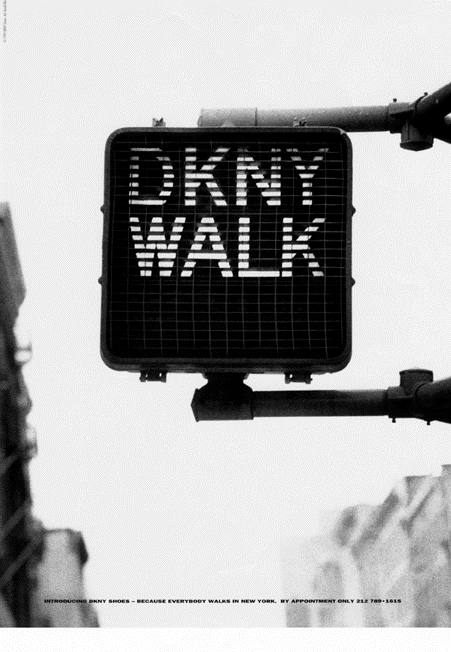
The purpose of the ad was to create stimulate interest and generate excitement for DKNY shoes. I believe the walk sign stood outside the offices of Arnell/Bickford at Grand & Mercer.)
Mies van der Rohe famous dicta: “God is in the details,” and “Less is more,” were not lost on Arnell, an architect and designer by training. In a successful New York brand, authenticity is in the details, and less is always more. Toward that end, the name DKNY is not only an acronym for Donna Karan New York; it is a New York City acronym. These letters, black on white, or white on black, resemble, and so suggest, the silhouettes of buildings and blocks.
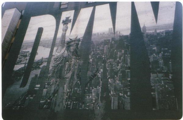
It is also an “official” New York City symbol, following the pattern established by other New York institutions—New York Police Department (NYPD) and Fire Department, New York (FDNY)—as well as an “unofficial one, reflecting New York’s preference for abbreviation, i.e., Bergdorf for Bergdorf Goodman or MoMA for the Museum of Modern Art. With the same appreciation for the “real,” Arnell would appropriate such New York iconography as skylines, bridges, and infrastructure—from the humble and seemingly invisible, i.e., sewer covers and street signs, to the grand, i.e., the Statue of Liberty and Empire State Building.
As I noted earlier many of these images had been used before—and in every imaginable context—what was original about Arnell’s work for DKNY was that these images and artifacts were never intended simply as props or sets. These appropriations had nothing to do with the advertising concept of “borrowed interest.”14 Nor we they intended, in the usual marketing sense, to encourage consumer identification with the brand being advertised.
In a brilliant counter-intuitive reversal of meaning, the appropriation of these things was not meant to signify DKNY, but rather DKNY was made to represent City. Which, is to say, consumers were not buying a DKNY black dress, but something unique and true to New York— an emotion, a frisson, or an attitude—that happened to be in the form of a black dress.
In addition to appropriating these images of the City, Arnell also put DKNY into the City, on its walls, streets and with skywriting, even its firmament. And, just as Lewis found that subway advertising: “…resonate[s] particularly clearly among urban populations because subways are themselves subjects of public discourse,”15 Arnell’s public work—a five-stories tall collage mural of the City, advertising on water towers, and even skywriting— became subjects of public discourse, and so gained further significance, because what happens on the street is always significant.15
A Mental Construction/Deconstruction Zone
In the popular imagination—the imaginary shaped and maintained by mass media—the City remains a “gritty” place. Gritty is a complex word with many meanings and connotations: a) a type of character i.e., tough; b) a portrayal of reality i.e., stark; and c) a condition of hygiene i.e., rough and dirty).
That the City continues to enjoy this reputation—perhaps best expressed by the gossip columnist,
J.J. Hunsecker in the film, Sweet Smell of Success (1957): “I love this dirty town” ——despite the abundant evidence to the contrary, is a testament to the pervasive influence of the City Mediascape. This concept continues to be operative even in the face of the reality of a “revived” 42nd Street, a Toronto-like Battery Park City, South Street Seaport, three Richard Meier’s buildings on West Street, and a Gwathmey’s tower on Astor Place. In fact, much of new development over the last twenty-five years which, with rare exceptions, such as the 1980s, One Worldwide Plaza, has studiously avoided architecture which referred to a New York style.16
The New York City we inhabit today is a “Mental Construction/Deconstruction Zone.” But this is not new nor news, as this dialectic has always been crucial in appreciating New York. Ideas, symbols and images, as well as buildings and neighborhoods are constantly being razed, raised, and repurposed. In his in June 3, 1933, column, “Skyscrapers and Tenements,” Lewis Mumford one of the City’s most astute critics wrote: “The skyscraper period is fast coming to an end, and the skyscraper, as we knew it during the past fifty years, has now pretty well reached the peak of its development.”17 Seventy-years later, James Traub writes about Times Square in his book, The Devil’s Play Ground, “This new Times Square of office towers and theme restaurants and global retailers and crowds and light and family fun is so utterly different both from the pathological Times Square of twenty years ago and the naughty, gaudy Times Square of seventy years ago that we almost need a different name for it. Certainly, we need a new way of thinking about it.” 18 Which is to say that the City’s ups and downs are alarming or thrilling, as the case may be, to those of us living here today, but rarely do contemporary critics get the City right.
Despite their famous “attitude” New Yorkers are perennially uncertain about their City’s fate.
E.B. White reflected on this unexpected vulnerability in his little book, Here is New York.19 Although White, writing in 1949, was haunted by the specter of the atomic bomb, and the possibility of the total destruction of the city he loved, the actual attack on 9/11 isolated the City in ways previously unimagined.
9/11(along with globalization and the advent of the digital world), not only made clear the distinction between the actual City and the City Mediascape but may have also erased any correspondence the two would have in the future. Which is to say that while the City Mediascape will always be intact and autonomous, New York can now be read as mortal or as simply another module on a complex global network.
9/11 revealed another aspect of the City Mediascape, namely it is the therapeutic value to the City. I believe the fiction of an insulated, dynamic, and seemingly impenetrable City had helped hold the City together and had essentially transformed the horror of 9/11 into merely an unhappy episode. As I wrote to friends only days following the attack, “We’re fine, in fact up on Madison Avenue, it’s Fashion Week, and, and as strange as it sounds, the mood is more La Dolce Vita than Apocalypse Now.”
A Place in the Process of Becoming an Imaginary Place
As noted above, New York is a place that most of us, even those of us born here, first encounter on television, in the movies, in photography, in fashion advertising—everywhere, in fact, but on its celebrated streets and inside its famous buildings. From this exposure we expect the City to look and to feel a certain way. In so far as we project these feelings and images, New York is less a City and more like the theme park.19 By theme park, I mean a place where we are led by our expectations, rather than our actual experience of the place.
I won’t go as far as to refer to our present City as an example of Baudrillard’s simulacra, because elements of the City Mediascape continue to be based in reality, i.e., 24-hours Korean markets confirm the idea of “the city that never sleeps,” and vice versa. But this concept is helpful in understanding where the City is headed. I will say that New York increasingly has more in common with Las Vegas or Venice, Italy, than with its own past.20 As a consequence, the City is increasingly less lived in than consumed, and as for the products consumed, they increasingly originate (and are available) outside the City. This is, of course, a global phenomenon; it merely arrived in New York a little later.
But what’s interesting is how quickly the City is surrendering its unique sense of self. The explanation goes beyond shifting lifestyles, new immigration patterns and evolving market forces. The arrival of hotel chains, big box stores and national retailers —the “malling” of the City—is sometimes protested, but largely accepted as inevitable. The outlawing of cigarettes, the enforcement of panhandling, and, in places, jaywalking regulations, suggest that changes to the City’s psyche follow those of its architecture. Along these lines, the City, as represented on TV and in the movies, looks suspiciously less like New York and more like every place else in the country (and increasingly the rest of the world).
I suspect the reason that more New Yorkers don’t resist this forced march into cultural homogeneity is not that there are fewer native New Yorkers, or that the New Yorkers who remain live in a state of denial, but that they inhabit concurrently two cities—the real and the City Mediascape. It has always been a joke among New Yorkers that they are the last to take advantage of New York. Natives famously have never been to the top of the Empire State Building or seen, close up, the Statue of Liberty. Adam Gopnik nicely observed this habit of indifference in an article he wrote for The New Yorker on the battle to preserve El Teddy’s, a restaurant and lounge in Tribeca. El Teddy’s had no particular history; it wasn’t a depression era speakeasy, or a celebrated nightspot—it wasn’t Toots Shor’s place, it wasn’t the 21 Club, it wasn’t even the Odeon.
This restaurant was best known for its eccentric architecture—the building was an unofficial landmark, marking the end of Soho and the beginning of Tribeca. (Or, the end of Tribeca and the beginning of Soho, depending on your destination.) Its most distinguishing features for those who cared about the building were its rooftop replica of the Statue of Liberty’s crown and its Gaudi-inspired stain glass canopy, which had been featured in the opening credits of the television show Saturday Night Live for more than a decade.
In his piece, Gopnik takes to task the sloppy, self-interested, kind of sentimentalism that affects New Yorkers whenever they feel their particular City is at risk. Which is to say, when reality confronts the City Mediascape. Writing about himself, Gopnik volunteered that while he had not been to Lincoln Center in over a year, and had no plan to go soon, he would rush to the barricades to defend it, should the forces of development were to ever threaten its existence. It was inconceivable to Gopnik that the City could exist without Lincoln Center. (On the other hand, Frank Gehry, a Canadian, a member of the global “technocratic elite,” who makes his home in Los Angeles, would happily destroy it, to save it, given the opportunity.)
New Yorkers have always inhabited narrow social and geographic circles. This is the only City in the world in which attractive men and women reject one another as “geographically undesirable,” although the distance in question between the two parties may have been as narrow as the width of Central Park, or a half hour ride on the #6 train.
The old school, but now almost extinct WASP, rarely, and then only on business or when slumming journeyed south of 42nd Street or north of 96th. The hipster in the Lower East Side considered any destination north of 14th Street as uptown, uptight and irrelevant.
As for the West Sider, there was, for all practical purposes, no East Side. Each community had its characters and myths, its strongholds and landmarks, but somehow they coalesced into the City.
If there is more mobility around the City today than in the past, it is because there is less that distinguishes one Neighborhood from another. And, if there seem to be fewer characters, it is because increasingly it is media, not place, that has the influence to shape character (or to breed “characters”). With the exception of impoverished areas such as East New York, or culturally segregated places, such as Howard Beach, gentrification and cultural homogeneity have in most cases erased the idea of neighborhood. For a street photographer like Lanzano the implications of this are ominous. As he says, “People are much less interesting to photograph.
But this is a relatively recent phenomenon, and the idea of neighborhood remains just as much part of the City Mediascape as when White wrote, “The city is literally a composite of tens of thousands of tiny neighborhood units. So complete is each neighborhood, and so strong the sense of neighborhood that many a New Yorker spends a lifetime within the confines of an area smaller than a country village.”21
What is different is that media, rather than ethnicity or class, create neighborhoods before they become actual real estate phenomena. Consequently, the new neighborhoods share little in common with those White described and that remain embedded in the City Mediascape. Nolita (North of Little Italy) or Tribeca (Triangle south of Canal) or BoCoCa in Brooklyn are unnatural appellations created by real estate interests; while Battery Park City speaks no more of New York than Jersey City across the Hudson. As for Little Italy, except for the protected blocks along Mulberry Street, it no longer exists, having been colonized by Greater Chinatown.
The newer communities, or designations, are largely defined by class and income, and sustained and promoted by lifestyle publications including the New York magazine and Time Out, as well as various lifestyle sections of the TIMES. These magazines and their equivalents on TV and in other media serve the same purpose as the original Sunset magazine described above. In this new City, authenticity is fungible, open to interpretation, and ultimately irrelevant.
As real New Yorkers become less like the New Yorkers inhabiting the City Mediascape—and more alike members of their own class in every city in the world, one would expect them to increasingly reject the old representations. And, yet, even as they attend the Opera in jeans, take their children to fine restaurants and wear Boston Red Sox caps in public, the old clichés still have purchase, although these tend to be increasingly watered down and made-to-measure.
Acknowledging these changes, over the last decade, DKNY has altered its appearance, adhering less strictly to the conventions of the City Mediascape; willing it seems to sacrifice “authenticity” for accessibility. DKNY would make many changes, but the most telling was the repudiation of Arnell’s black & white city.
Donna Karan Sees the City in Color
Over the last 20 years, DKNY has grown into a global brand by internalizing and exploiting the values and vocabulary of the City Mediascape. What was unique in its positioning was how the brand took its identity from the City itself—from its built environment, its physical realities, and ideologies. It did not make a fetish of the City’s iconography but incorporated them. In current advertising terms, New York was the Brand’s DNA. The success of the brand (and its potential value) was made clear when the company was acquired by LVMH Moet Hennessy-Louis Vuitton for more than half a billion dollars.15 It was the brand’s global ambitions that necessitated a close self examination and its repositioning.
According to Trey Laird, President and Executive Creative Director of Laird+Partners, the first color ad appeared in 1991, not long after he took over the advertsing.23 Karan had awakened one morning and decided she wanted color. She realized the City was awash in color and that “There was beauty in New York.” (See Ill.5)
On the surface, there was nothing inconsistent in Karan’s epiphany. There is color everywhere in the City, which Laird, enumerated: “The four seasons, yellow taxis, traffic lights, Chinatown, blues clubs, and all these are part of the New York experience.”
For Karan, the original imagery that inspired and shaped the brand was suddenly too literal. It was decided that in the future these images and black & white would continue to guide the brand but no longer lead it. As DKNY continued to grow—more than twenty different product categories, licenses and divisions—Karan and Laird came to the conclusion that the brand had to expand beyond literal representation of the City in order to appeal to greater and greater numbers of consumers.” Although one might question the logic of making a brand less like New York, in order to sell the concept of New York, that wasn’t the idea.
Laird, thought it necessary for DKNY to move beyond the textures of pavement, material of building, and visual iconography of New York. “The City would remain part of the brand’s DNA, but its references would become more abstract.” Laird went on to say, “The work is more true, and most successful when it’s an honest inspiration from New York. We were looking to make a pure reference, not a literal one.”
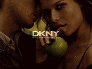
What does a “pure reference” look like? (See Ill.6) When DKNY introduced its new fragrance “Be Delicious,”24 it was not packaged in a generic glass bottle with a chrome top. Instead, DKNY used the image of the apple, intending to reference The Big Apple. “It’s interesting,’ Laird observed, “that even if consumers don’t get the reference, we believe it works on a subliminal way, because it’s consistent and true to the brand.”
But one might question the “purity” of the reference to The Big Apple. While it’s true the phrase was a genuine jazz age code for the New York City, today it is a cliché that belongs not in discourse but in the souvenir counter of our consciousness.
When Laird insists that the deviation from black & white is consistent with the new New York City, he’s not wrong. There is more color in the City, including the color lights that both decorate and domesticate the Empire State Building, and there is the colorization of the TIMES, and today’s Great White Way has more colors than a box of crayolas. But none of these innovations have served the original well, and in both cases, what may have made them more accessible, or popular, has done so at the cost of their credibility. In any event, as in the case of colorizing old movies, something important was lost with the addition of color.
Laird also points out that while architecture may be where the brand began, it is no longer limited to that dimension. The new work is about, “How people live today. It is about the energy of the City and how people thrive on it.” To Karan and Laird, depictions of cobblestones and street signs were merely “scratching the surface of the City.” They believe the new work goes much deeper—to “how people entertain themselves, amuse themselves and consume the City.” What DKNY does not seem to realize that in their desire to show how New Yorkers live, they’ve effectively reduced New York to a playground and shopping center. (See Ill.7)
To my mind, the new work is less about New York and more about a city, which is to say that it is informed less by the City Mediascape and more by current entertainment and advertising conventions—conventions that are increasingly applicable anywhere.
But Karan and Laird may not be wrong. Ultimately theirs are business decisions not aesthetic ones. On the one hand, the brand’s concerns remain local and domestic, or more specifically, the domestic market i.e., the fashion press, Tribeca Moms, and the women who lunch at Balthazar or Barney’s and their sisters in West Los Angeles, as well as less upscale woman shopping in a suburban mall “wherever.” But on the other hand, DKNY is a global brand, selling its wares to women in Tokyo, or in Paris or in Moscow.
Lewis had asked, “Are the media of consumption changing collective identification with potential impact on nationalism, cosmopolitanism and local identity formation?” I believe the answer is self-evident: 1) Informed by media people recognize, desire and sustain affinities that transcend local and national forms of associations and meaning, and 2) As media is global, these new affinities may be inevitable.
Laird confirms this saying. “The perception [presence] of New York is what adds value to the communication.” The point Laird wants to make is that “There’s more than prestige associated with the brand. DKNY comes with more than its label.” Laird’s observation suggests the more successful DKNY is abroad, the weaker the consumers’ ties are to their own city, nation or culture.
Laird believes that ultimately, “Every DKNY product is an image of New York. The point being that the consumer, simply by wearing this or that accessory or article of clothing, will feel more sophisticated, just like a real New Yorker.” The message here is that everyone, everywhere, can experience New York through DKNY.”
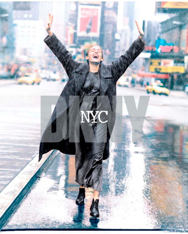
The promise of an out-of-place experience is a compelling one. Increasingly technology allows us to avoid our physical environment and inhabit the spaces we prefer. DKNY promises the idea of New York, and their advertising is conceived to create a place people will actually prefer. We are familiar with these imaginary New Yorks—from Friends and Sex in the City to The Apprentice and Melinda and Melinda. A closer approximation, to the real city, which Arnell sought, is beside the point to Laird, who makes clear that while DKNY is not the literal New York, it is a New York sensibility, a kind of waking dream, a New York State of Mind. (See Ill.8)
Summary: Uninhabited and Uninhabitable
For Karan and Laird, the move to color was a deliberate move away from what they considered a retro image of New York. To their minds, black & white, belonged to the category of souvenir and lacked the contemporary sophistication they believed necessary to build a global brand. As in the old joke, the old New York was too New York.
DKNY will, of course, continue to mine the City for images and symbols, for example, a recent newspaper insert, is a fair imitation of the TIMES “Sunday Style Section,” but their New York is focused on the 21st Century City.
Arnell, on the other hand, believes the new direction is inauthentic and that Karan and Laird have fixed on the most superficial and temporal aspect of the New York—fads and trends—at the expense of the City’s physical realities and eternal verities.
For Arnell it is the once and future aspects of the City Mediascape that are at the heart of persuasive communications. Arnell’s New York is both a real and conceptual place existing in real time. It is not a Venice frozen in time, or n a Buffalo passed by time, or even a town like Celebration conceived to defy time. As such Arnell believes that the City Mediascape can withstand its contradictions and discontinuities so long as it continues to satisfy our need for it.
It seems to me that both Arnell and Laird New York understand the City as a heterotopia, a term Foucault defined as: “Real places which are something like counter-sites, a kind of effectively enacted utopia in which the real sites, all the other real sites that can be found within the culture, are simultaneously represented, contested, and inverted.” Which is to say they both confuse the physical City they inhabit with the City Mediascape in which they believe they live. The concept of a heterotopia helps explain their ability to pick and choose not only what constitutes the City, but also to determine what is authentic and what is not.
The ultimate difference between Arnell’s and Laird’s New York is as significant as it is telling. Arnell city, eternal, significant and unique rests on bedrock (Manhattan Schist to be specific); Laird’s New York is transient, episodic, contemporary, consisting of interchangeable parts. But while Arnell’s conception is every bit as media influenced as Laird’s, it differs in an important respect. Arnell’s City is felt while Laird’s is seen. One might say that the former’s knows his City from the street itself, while the latter’s experience was shaped by television and the movies.
On the other hand, Laird’s work is advertising, image-making with a job to perform. Arnell’s work was something different and can be understood in the tradition of the City Symphony: “In a city symphony—which can be an entire film or part of a larger narrative—the city and its architecture take center stage. Instead of plot and dialogue, actors and sets, the city symphony uses building, streets, bridges, and vehicle, showing us how cities rattle and rush, stream and plod, awake and settle down.” 26 As beautiful as Arnell’s work often was, and as “true” as it appeared to be, whether this approach would succeed as advertising today is open for discussion.
But what both visions have in common is that neither of them is inhabited or, in fact, habitable. Which leads me to the question: Can New York ever again be experienced except as a Mediascape? Although on might also ask, has the City, since the advent of mass media and entertainment, ever existed except as an imaginary construct?
I believe that the health and even continuity of New York depends to a large degree on maintaining a balance, or some correspondence, between New York and its Mediascape. What we do preserve or wish to preserve—who and what we invite into the City, and who and what we want to exclude, can be determined by the image of the City we collectively embrace. Which is to say, that to the extent we value mirroring over representation and the bedtime story to myth, our Mediascape will detach will from the actual City and eventually vanish from our consciousness.
This, I believe, would be an expression of decadence in the most formal sense of the word, a decline. New York can only exist as New York—City and Mediascape aligned—and at the point it abdicates its sense of place, i.e., DKNY colorizing the City to meet the expectations of global markets, it will have run its course. Of course, the City has had a very good run. And, in matters such as these, I think it’s helpful to keep in mind what one of the anonymous cab drivers quoted in Risa Mickenbeg’s Taxi Driver Wisdom observed: “The traffic— it slows, it speeds up again, [and] for no reason sometimes.”
NOTES
- Throughout this paper I will refer New York City or Manhattan as the “City.” No disrespect in intended by my exclusion of the other four boroughs that together with Manhattan, define the city of New York.
- This is a serious consideration and not meant as a literary or intellectual trope.
- Lewis, Steven W, “The Media of New Public Spaces in Global Cities: Subway advertising in Beijing, Hong Kong, Shanghai and Taipei,” published in “Continuum: Journal of Media & Cultural Studies,” Vol.17, No.3, 2003,
- Breakfast at Tiffany’s, dir. Blake Edwards, Paramount Pictures, 1961, based on the novel by Truman Capote, 1958
- The informal survey may prove, and sooner rather than later, less helpful, as it seems fewer people are familiar with moves that predate their movie-going experiences. In my few months at The New School, I’ve been astonished by the number of students unfamiliar with films I’ve considered classics. These include Fellini’s La Dolce Vita Peckinpah’s ’The Wild Bunch, Kazan’s On the Waterfront, and Jean-Luc Godard’s Contempt. Susan Sontag anticipated this in her essay, “Melancholy Objects” included in her book On Photography. “…a growing reluctance on the part of young people to read anything, even subtitles in foreign movies. “
- Manhattan, dir. Wood Allen, MGM, 1979. The film was shot in black & white.
- While the black limousine retains its classic status, the advent of the SUV offered status-conscious consumers an updated version, but while the vehicle has changed, the preferred color remains black. (The white limos as well as novelties like the white stretched Hummers that clog our streets are the choice of prom-goers, arriviste entertainers and provincials.
- “Eight million stories in the naked city,” voice over from the classic New York police procedural Naked City. For more on this show and its intelligent and nuanced view of the City, see Michael Schwarzer’s Zoomscape, “Chapter 6: Television”
- Sunset Magazine was introduced in 1898 by the Southern Pacific Railroad, at the time the largest landowner in California, to “combat negative images etched in minds on the East Coast.” In a sense, “California became the state described in the early issues of the promotional organ.” ‘How Sunset Magazine Won the West,” from Sunset Home Page, http://www.sunset.com/sunset/web/Magazine/SunsetHistory.html
- Apropos of Duchamp, “… perhaps the most important art-theorist and avant-garde provocateur of the 20th century. He directed attention away from the work of art as a material object, and instead presented it as something which was essentially an idea: he shifted the emphasis from making to thinking.” Edward Lucie-Smith.
- Any reference to Peter Arnell originated from my dinner with the man at Da Silvano, May 4, 2005, except where otherwise noted.
- Schwartzer, Michael, ZOOMSCAPE, Princeton Architectural Press, 2004
- “Borrowed interests” refers to the juxtaposition of a valuable or credible object or person with a product, being advertised i.e., the Buick Park Avenue shot on Park Avenue. The intent is to affect a transfer of meaning between the object and the product. It is very common but rarely effective. In the case of the example above, the association is too facile, and in fact, too antiquated to resonate with consumers.
- The DKNY mural was hand-painted from an Arnell photograph taken out of a seaplane window. It shows a panorama of Manhattan Island as seen through four cutout letters. After 9/11 there was some thought to remove or alter the mural, which has overlooked Broadway and Houston Street since 1989. In the end, it was decided not to change it, as Arnell told the TIMES, “The critical thing is you don’t change history, You understand it differently. You understand it differently.”
- Lewis, Steven W, (See note 3)
- Meier’s residential towers on Perry & West, are a handsome repudiation of the relevance of the City Mediascape. On the other hand, there is no place in the City Mediascape for Meier.
- Wojtowicz, Robert, Sidewalk Critic: Lewis Mumford’s Writing on New York, Princeton Architectural Press, 1998
- Traub, James, The Devil’s Play Ground, Random House, 2004
- White, E. B., Here is New York, With a New Introduction by Roger Angell, a New York Bound book, The Little Bookroom, New York, 1999
- My use of theme park is intended as include more spaces than Disneyland or the Strip in Las Vega. I would include here, central Paris, Venice, and Jerusalem, in fact, any space concerned with preserving its idea of itself.
- White, E.B., see #18
- New York City Ethnics—Eastern European Jews, Southern Italians, Irish and perhaps Greeks—both a “theatrical type” and a political designation is another ‘breed of New York that thrived with the spread of photography and movies, but that has been largely bred out of existence by upward mobility, intermarriage and the arrival of new, less photogenic immigrants such as those from Haitians, Pakistani, Indians, Bangladeshi, West Africans, East Africans, African Americans, Latinos from places as diverse as Ecuador and Puerto Rico, and occasionally Egyptians, Chinese, Koreans and Russians. The few Americans of Western European decent still driving cabs do so because they are compelled to supplement their social security checks.
- “We see our acquisition of Donna Karan as great opportunities to further develop this wonderful brand name in an international context,” says Myron Ullman, group managing director of LVMH. Donna Karan International will benefit from LVMH’s experience in production and distribution as well as in finance, advertising, and real estate. It will become part of the LVMH Fashion Group, which includes Louis Vuitton, Berluti, Christian Lacroix, Fendi and others. From Press Release, December 18, 2000.
- Any reference to Trey Laird originated from the interview I conducted with the man April 8, 2005.
- Apropos of the notion of authenticity, while I could find references to Red and Golden Delicious apples I could not find a source for a Green Delicious. The apple pictured in the DKNY advertisements looks suspiciously like a Granny Smith. I don’t know what green has to do with New York, except New Yorkers often envy their neighbors. (In the TV online spot, it is the man who hands the apple to the woman, in the new telling of our creation myth; it is the man who corrupts the woman.)
- Foucault, Michel, Des Espace Autres (Of Other Space, Heterotopias), in “Architecture/Mouvement/Contiuité,” October 1984 (from lecture given in March 1967) Translated from the French by Jay Miskowiec Schwartzer, Michael, ZOOMSCAPE (see #12)